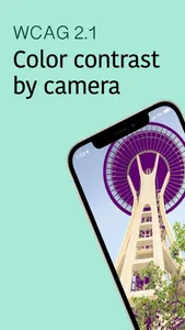
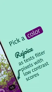
Use your camera to get a feel what WCAG's color contrast ratio. Any pixel in your camera feed that doesn't pass WCAG's guidelines for your chosen contrast color will get knocked out of the picture by Metal. You can also see contrast testing in live color blindness simulations (Machado et al.).
The Web Content Accessibility Guidelines 2.1, which Apple recommends developers follow, sets a minimum luminance contrast ratio for legible text and icon states.
(To state the obvious, iPhone and iPad sensors do not magically quantify photoelectrons into absolute lumens. WCAG's heuristic is intended for screens, not whatever exposure bias you choose. This is a conceptual way to explore the guidelines IRL, not some shortcut to telling legal, QA or UX that you tested the latest release super quick... just go have fun.)
Show More


