AppRecs review analysis
AppRecs rating . Trustworthiness 62 out of 100. Review manipulation risk 21 out of 100. Based on a review sample analyzed.
★
AppRecs Rating
Ratings breakdown
5 star
100%
4 star
0%
3 star
0%
2 star
0%
1 star
0%
What to know
✓
Low review manipulation risk
21% review manipulation risk
✓
High user satisfaction
100% of sampled ratings are 5 stars
About Kotlin Material UIX Template
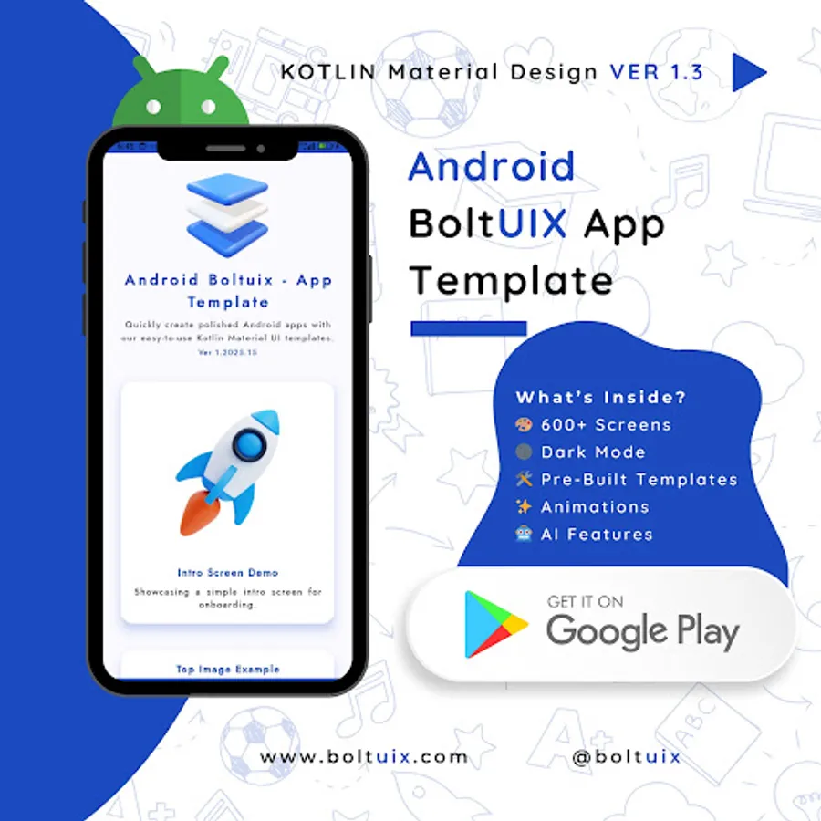
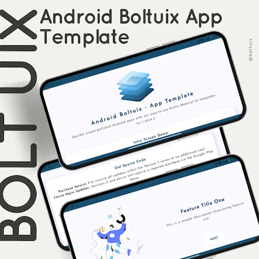
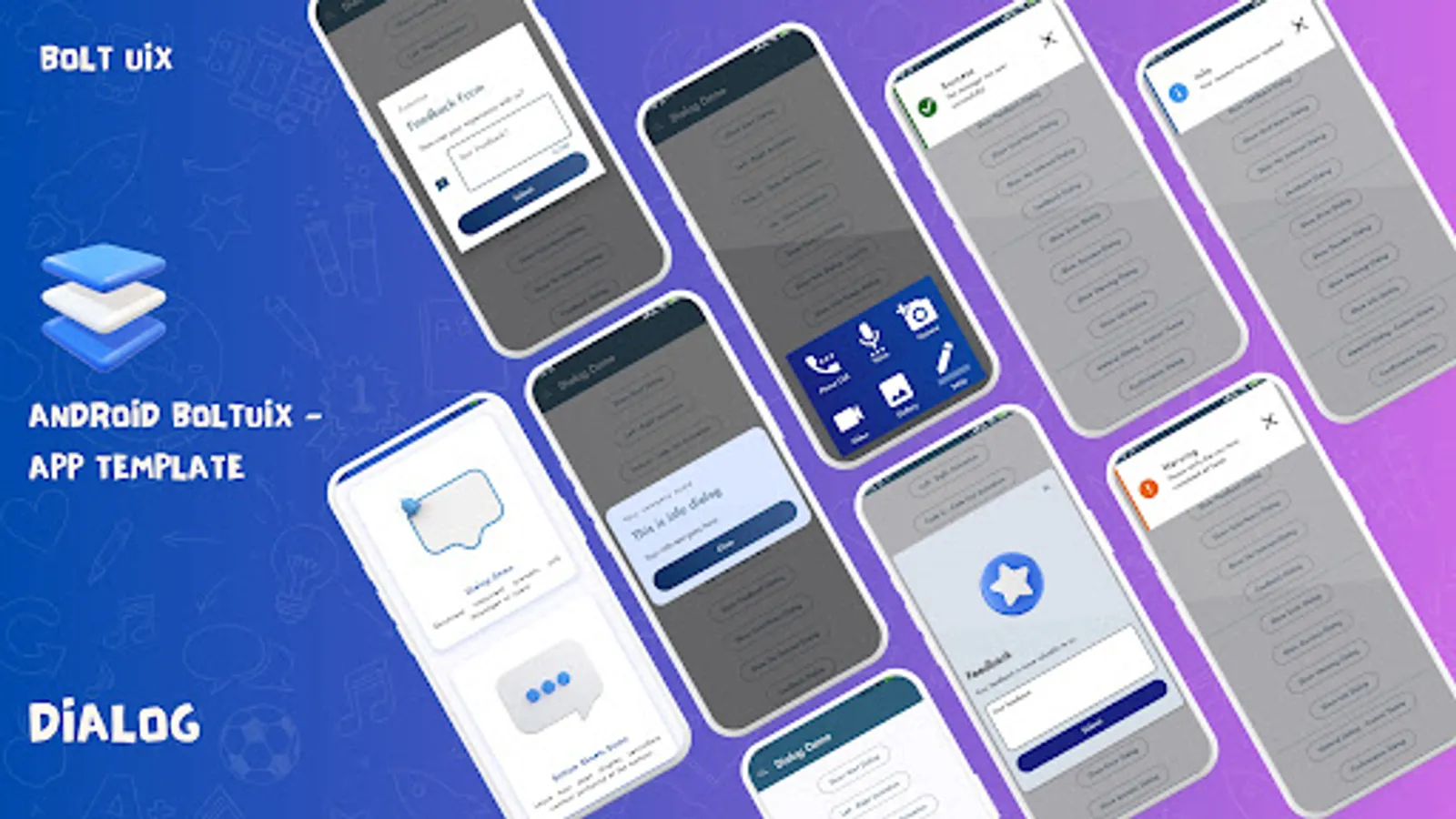
Android Boltuix - App Template: The Ultimate Kotlin Material Design UI Toolkit
Our Mission:
* Empower Android developers with a ready-to-use Material Design UI template.
* Streamline converting design ideas into native Android code.
* Deliver intuitive, cutting-edge Material Design features to your apps.
Top Reasons to Choose Android Boltuix:
* Prebuilt UI Components: Reusable, adaptable templates for all projects.
* Kotlin Integration: Works seamlessly with Android Studio workflows.
* Material Design Mastery: Build stunning, user-friendly UIs effortlessly.
* Dark Mode Ready: Optimized designs for light and dark themes.
* Time-Saver: Focus on logic while we simplify the design process.
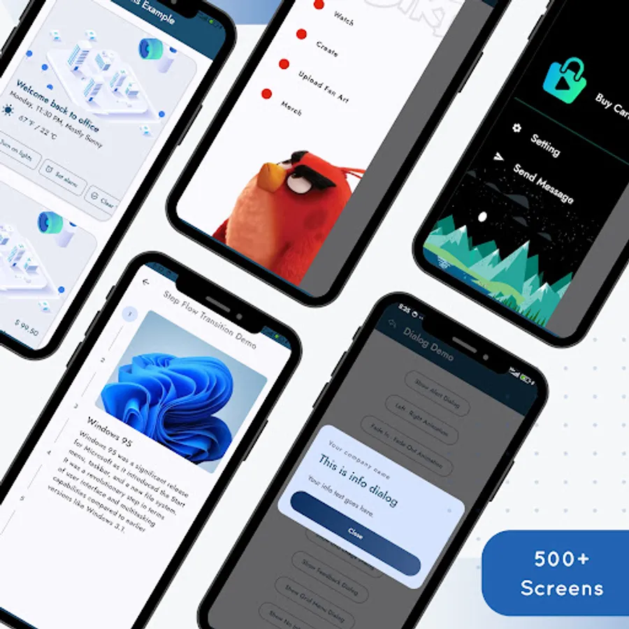
What’s Inside?
* Dive into a rich collection of UI templates and demos to boost development and spark inspiration.
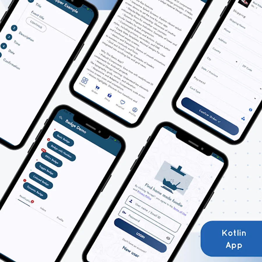
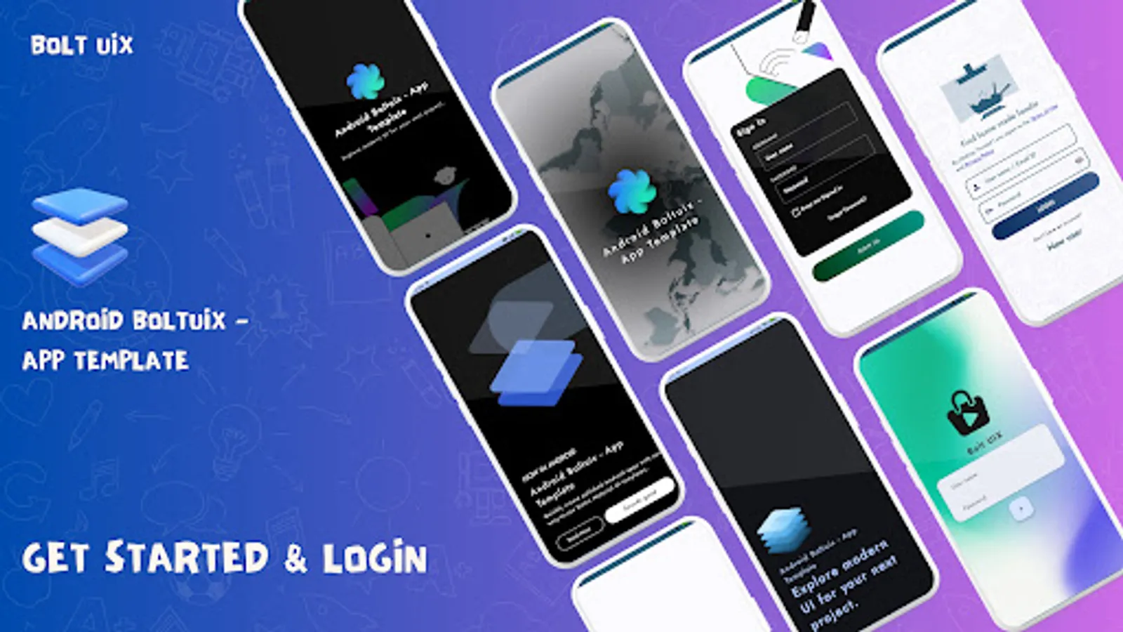
🎠 Onboarding and Splash Screens
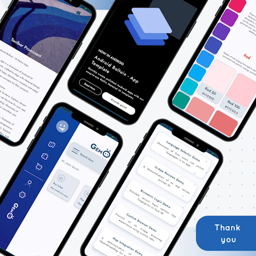
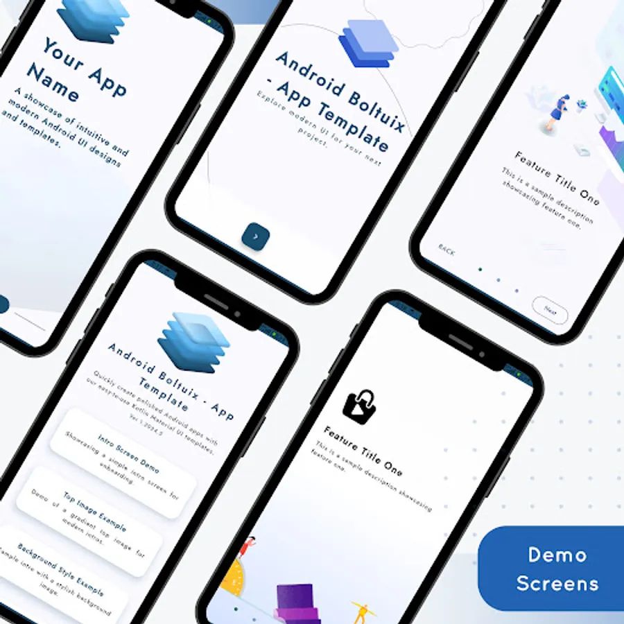
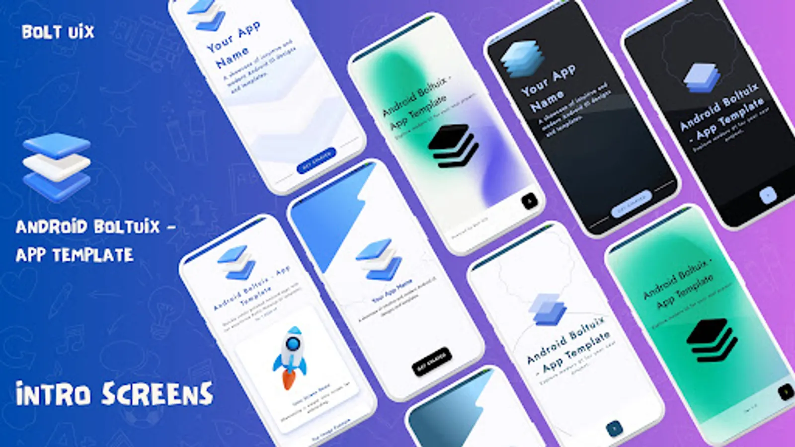
🚀 Splash Screen Styles: Top Image, Full Background, Material Bounce, Transitions.
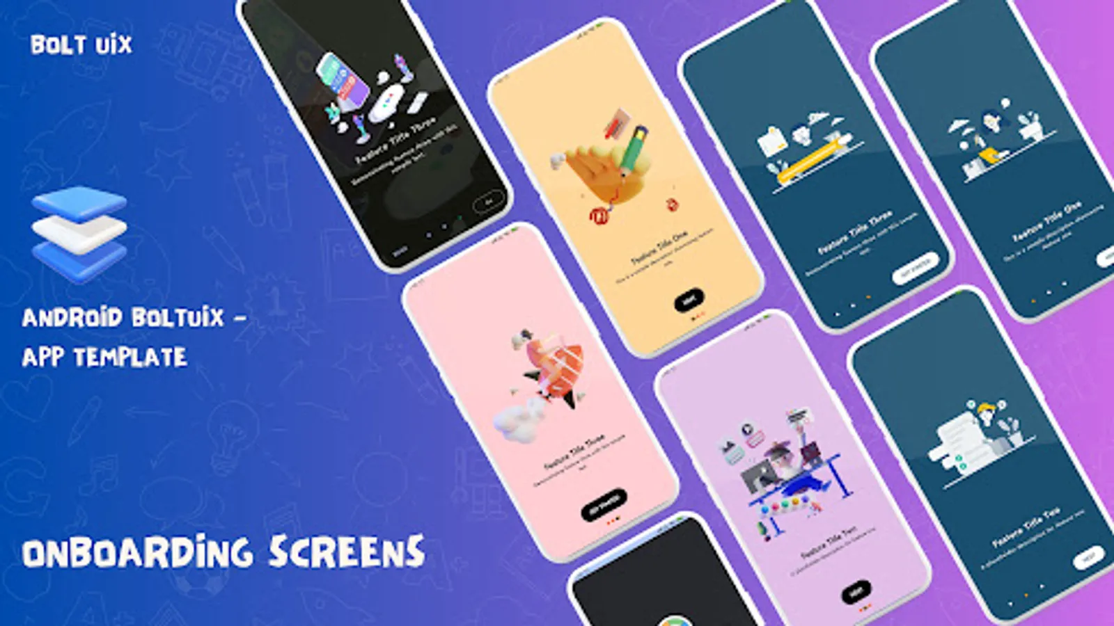
🎨 Animated Onboarding: Card-based designs with sleek sliding effects.
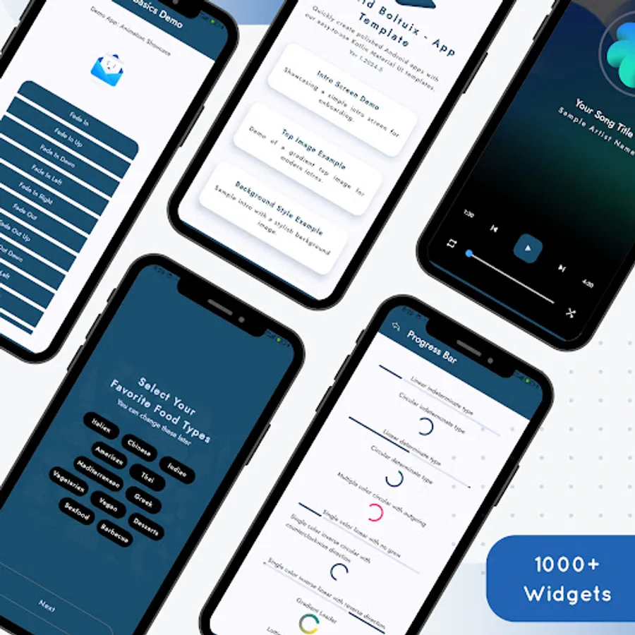
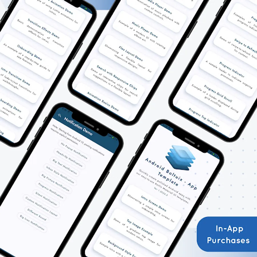
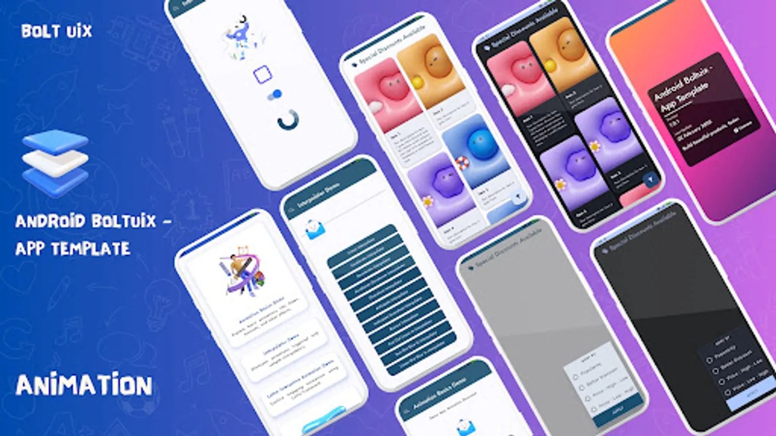
⏳ Progress Indicators and Empty States
🔄 Progress Indicators: Circular, linear, and grid-embedded loaders.
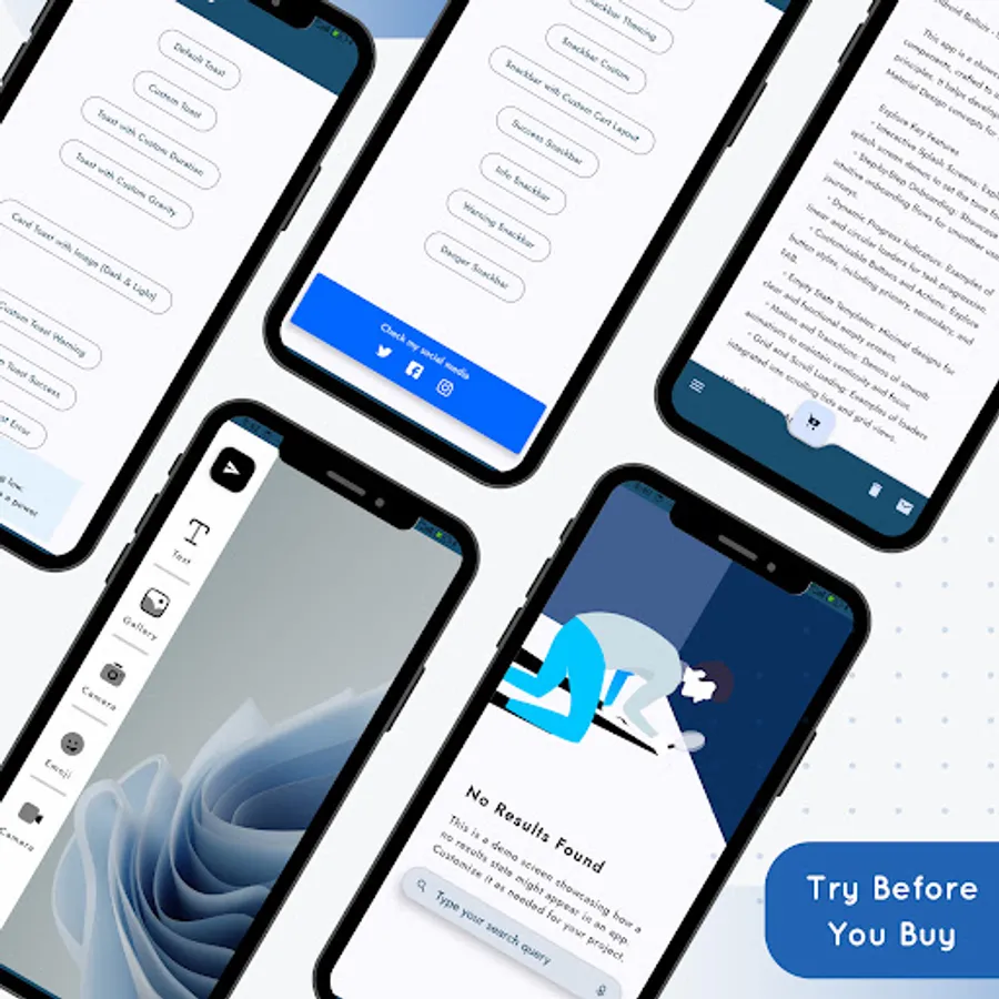
❌ Empty States: Ready templates for "No Connection," "No Results," "Payment Error," etc.
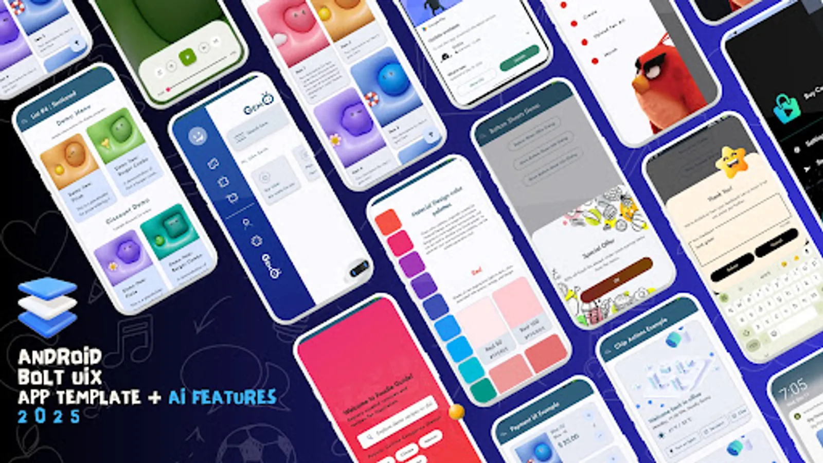
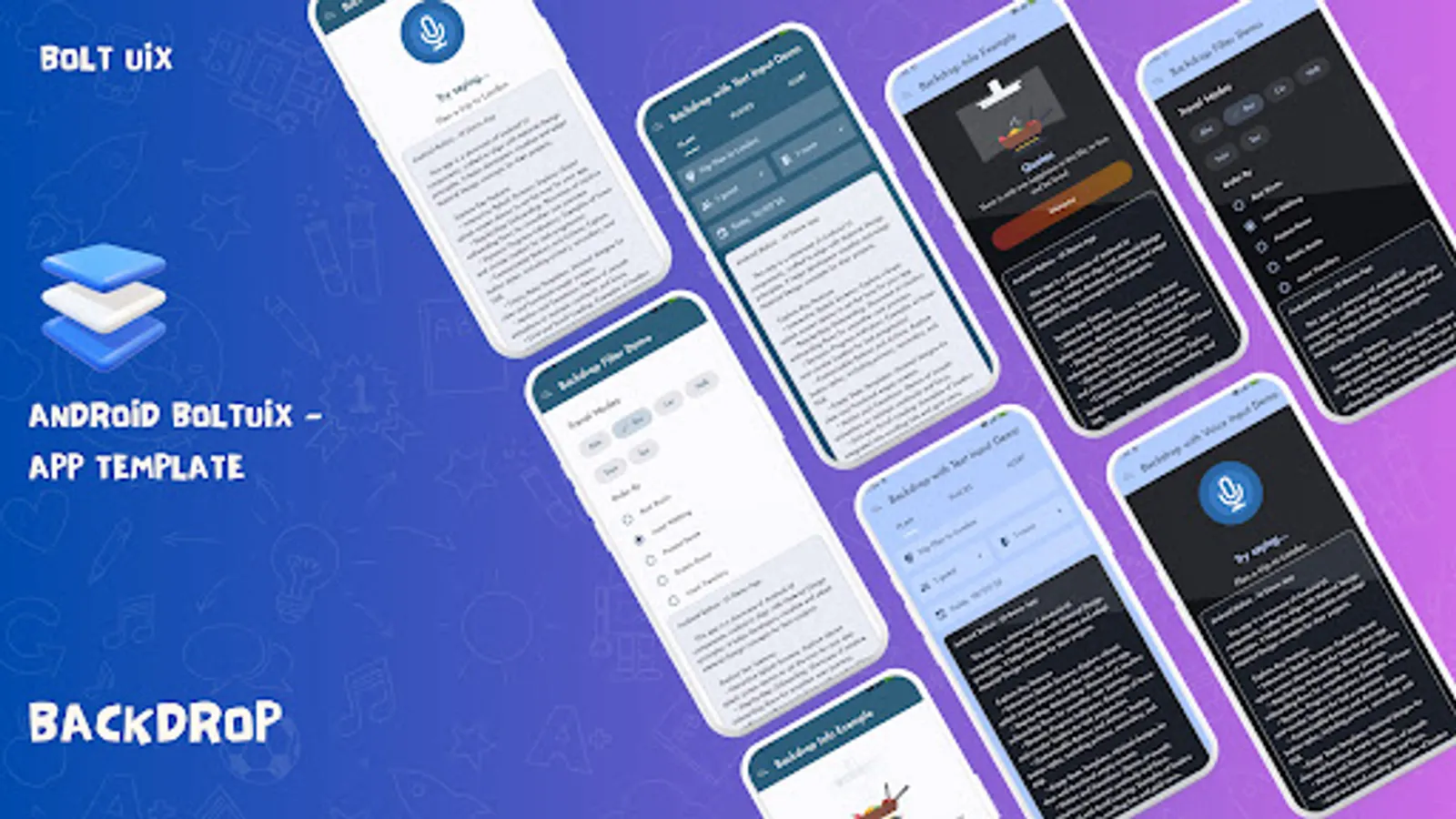
🎥 Media and Interaction Demos
🎥 Media Players: Stylish video and music UI templates.
💬 Chat Layouts: Modern messaging designs for better engagement.
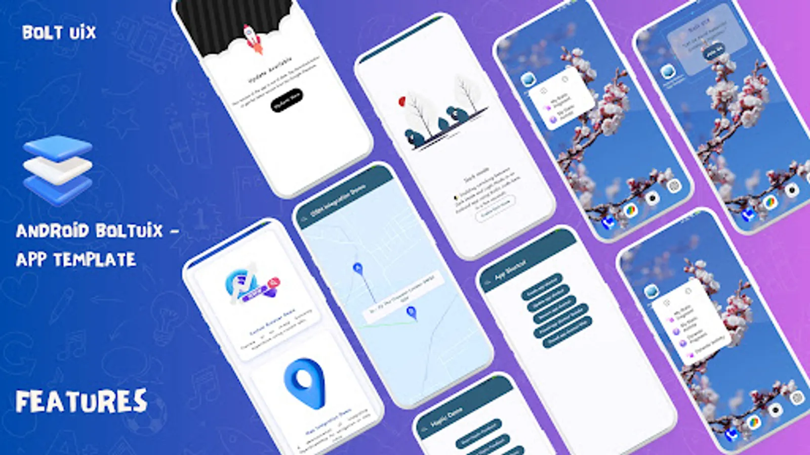
🗺️ Map & Web Integration: Open Street Map and Chrome Tabs for travel/content apps.
⚙️ App Functionalities
🔒 Biometric Login: Secure, user-friendly authentication templates.
⭐ In-App Reviews: Templates to collect user feedback effortlessly.
🔄 Update Screens: Force updates and in-app update designs.
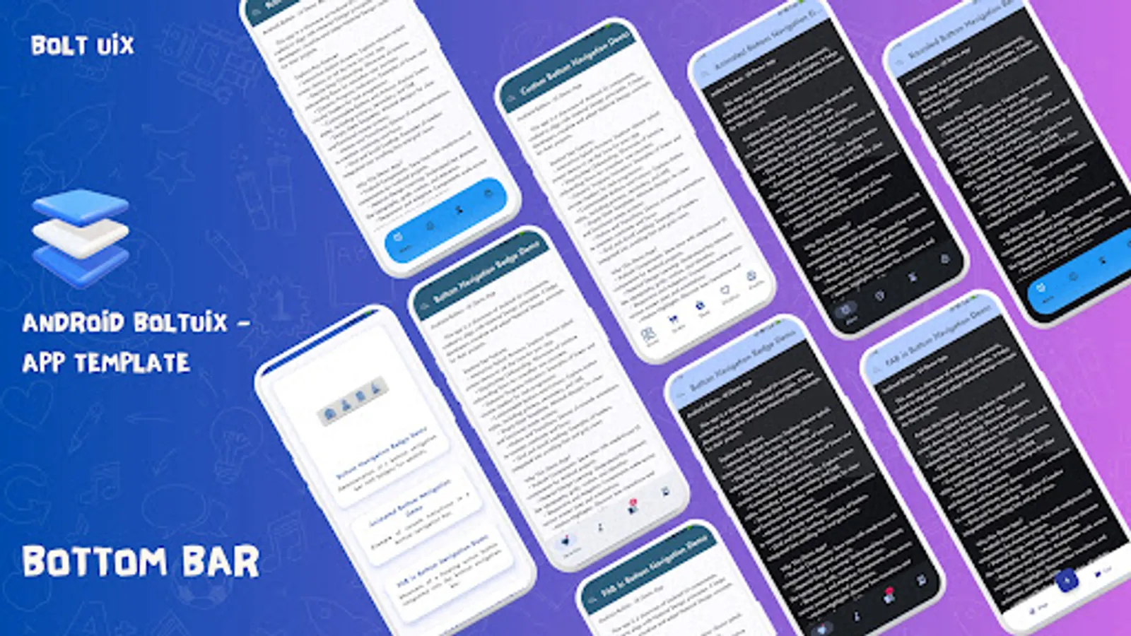
🖼️ Design and Navigation
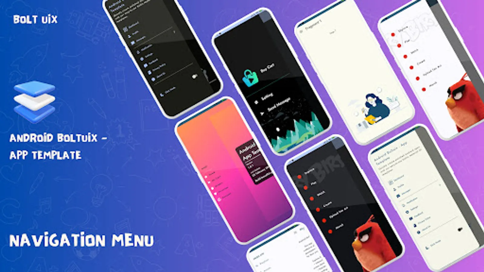
🗂️ Navigation Options: Drawer and Bottom Nav with badges and animations.
🎨 Material Colors: Unified, vibrant designs with Palette API.
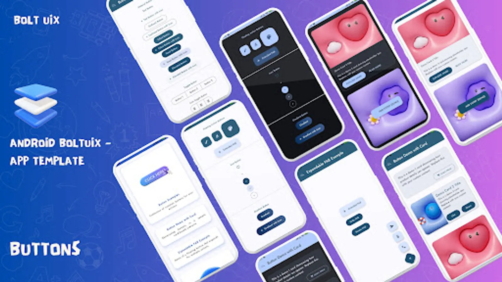
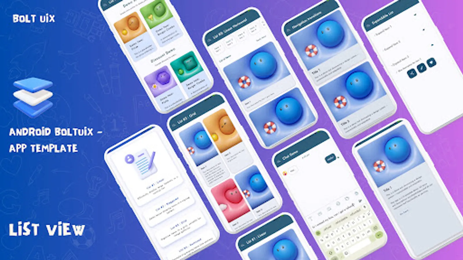
📋 Cards: Grid, expandable, and constrained layouts for content display.
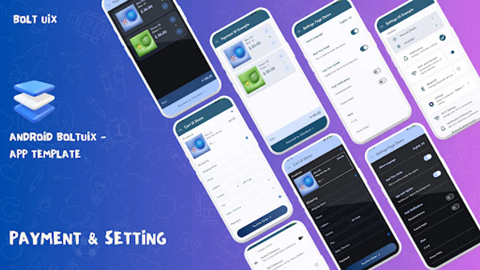
🛒 E-Commerce Demos
🛒 Cart Management: Add/remove items with fluid animations.
💳 Payment UI: Razorpay-ready templates for smooth transactions.
📦 Order Tracking: Visual progress layouts for delivery updates.
🔄 Motion and Animation
✨ Core Animations: Smooth transitions with interpolators.
📋 Stepper Flows: Simplified multi-step process templates.
🎥 Motion Filters: Pro-level Material Design animations.
🔧 Custom Controls and Settings Templates
✅ Selection Controls: Custom radio buttons, switches, and sliders.
⚙️ Settings UI: Templates for app settings and personalization.
💡 Menus & Tooltips: Interactive guides to enhance user experience.
📋 Advanced UI Templates
🗺️ Dashboards: Sleek layouts for trip planners and chatbots.
⛓️ Bottom Sheets: Persistent and modal designs for dynamic content.
✍️ Typography: Creative text styling with multiple spans.
Why UIX Design is Crucial for Android App Development
https://www.boltuix.com/2024/12/why-uix-design-is-crucial-for-android.html
Our Mission:
* Empower Android developers with a ready-to-use Material Design UI template.
* Streamline converting design ideas into native Android code.
* Deliver intuitive, cutting-edge Material Design features to your apps.
Top Reasons to Choose Android Boltuix:
* Prebuilt UI Components: Reusable, adaptable templates for all projects.
* Kotlin Integration: Works seamlessly with Android Studio workflows.
* Material Design Mastery: Build stunning, user-friendly UIs effortlessly.
* Dark Mode Ready: Optimized designs for light and dark themes.
* Time-Saver: Focus on logic while we simplify the design process.
What’s Inside?
* Dive into a rich collection of UI templates and demos to boost development and spark inspiration.
🎠 Onboarding and Splash Screens
🚀 Splash Screen Styles: Top Image, Full Background, Material Bounce, Transitions.
🎨 Animated Onboarding: Card-based designs with sleek sliding effects.
⏳ Progress Indicators and Empty States
🔄 Progress Indicators: Circular, linear, and grid-embedded loaders.
❌ Empty States: Ready templates for "No Connection," "No Results," "Payment Error," etc.
🎥 Media and Interaction Demos
🎥 Media Players: Stylish video and music UI templates.
💬 Chat Layouts: Modern messaging designs for better engagement.
🗺️ Map & Web Integration: Open Street Map and Chrome Tabs for travel/content apps.
⚙️ App Functionalities
🔒 Biometric Login: Secure, user-friendly authentication templates.
⭐ In-App Reviews: Templates to collect user feedback effortlessly.
🔄 Update Screens: Force updates and in-app update designs.
🖼️ Design and Navigation
🗂️ Navigation Options: Drawer and Bottom Nav with badges and animations.
🎨 Material Colors: Unified, vibrant designs with Palette API.
📋 Cards: Grid, expandable, and constrained layouts for content display.
🛒 E-Commerce Demos
🛒 Cart Management: Add/remove items with fluid animations.
💳 Payment UI: Razorpay-ready templates for smooth transactions.
📦 Order Tracking: Visual progress layouts for delivery updates.
🔄 Motion and Animation
✨ Core Animations: Smooth transitions with interpolators.
📋 Stepper Flows: Simplified multi-step process templates.
🎥 Motion Filters: Pro-level Material Design animations.
🔧 Custom Controls and Settings Templates
✅ Selection Controls: Custom radio buttons, switches, and sliders.
⚙️ Settings UI: Templates for app settings and personalization.
💡 Menus & Tooltips: Interactive guides to enhance user experience.
📋 Advanced UI Templates
🗺️ Dashboards: Sleek layouts for trip planners and chatbots.
⛓️ Bottom Sheets: Persistent and modal designs for dynamic content.
✍️ Typography: Creative text styling with multiple spans.
Why UIX Design is Crucial for Android App Development
https://www.boltuix.com/2024/12/why-uix-design-is-crucial-for-android.html


