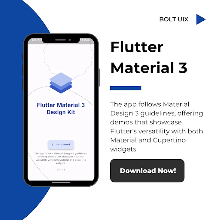
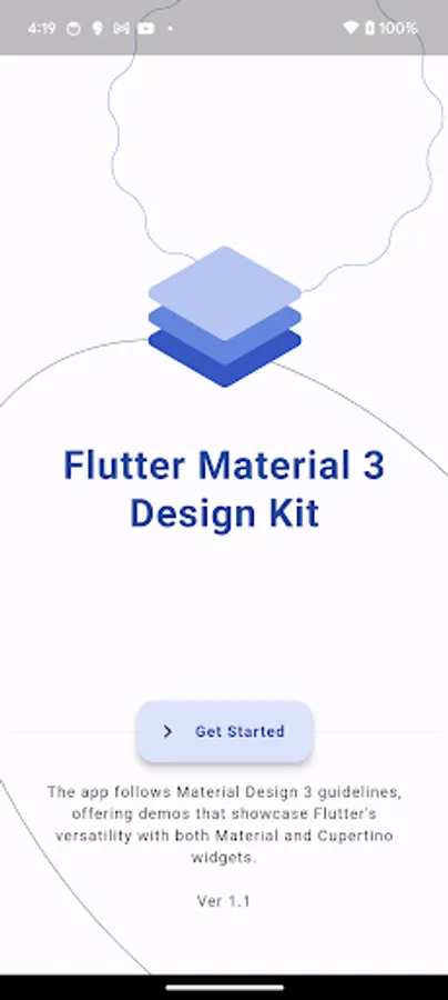
Flutter Material 3 Design Kit
BOLT UIX
5,000+
downloads
Free
AppRecs review analysis
AppRecs rating 3.5. Trustworthiness 82 out of 100. Review manipulation risk 21 out of 100. Based on a review sample analyzed.
★★★☆☆
3.5
AppRecs Rating
Ratings breakdown
5 star
50%
4 star
10%
3 star
20%
2 star
0%
1 star
20%
What to know
✓
Low review manipulation risk
21% review manipulation risk
✓
Credible reviews
82% trustworthiness score from analyzed reviews
✓
Good user ratings
60% positive sampled reviews
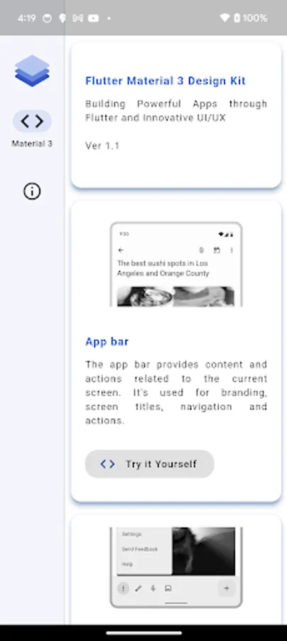
About Flutter Material 3 Design Kit
Dive into the world of Flutter with our comprehensive Material 3 Design Kit! Our app meticulously follows the Material Design 3 guidelines, providing a rich assortment of demos that highlight Flutter's unparalleled versatility. From essential components like app bars, bottom navigation, and navigation drawers to advanced features such as date pickers, snackbar notifications, and complex navigation transitions, our kit covers it all. Whether you're crafting a sleek Material-themed interface or embracing the iOS-inspired Cupertino aesthetic, our kit offers a plethora of widgets and design elements to elevate your app's user experience. With support for Google Fonts, responsive layouts, and seamless transitions, our kit empowers developers to create stunning, intuitive applications for both Android and iOS platforms. Explore the possibilities of Flutter today with our Material 3 Design Kit! 🎨✨
Flutter Material 3 Design Kit 🎨
App bar 📱
Bottom app bar ⬇️
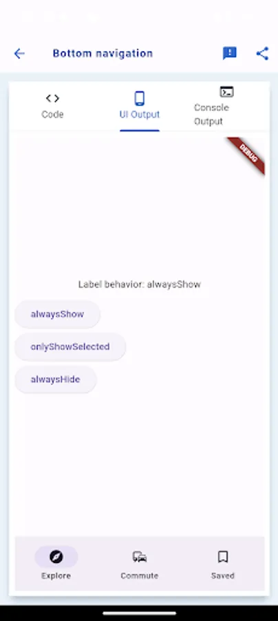
Bottom navigation 🚶♂️
Navigation drawer 🗄️
Navigation rail 🚋
Tabs 📑
Elevated Button 🔼
Filled Button 🟦
Filled Tonal Button 🟦
Outlined Button 🛑
Text Button 🔠
Bottom navigation 🚶♂️
Navigation drawer 🗄️
Navigation rail 🚋
Tabs 📑
Elevated Button 🔼
Filled Button 🟦
Filled Tonal Button 🟦
Outlined Button 🛑
Text Button 🔠
Text Gradient Button 🌈
FAB Regular 💡
FAB Small 💡
FAB Large 💡
FAB Demo 💡
FAB Color Mappings 💡
FAB extended 💡
Icon Button 🔘
Icon toggle Button 🔘
Segmented Button 🔍
Menus 🍽️
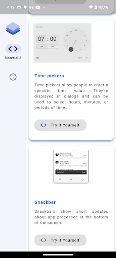
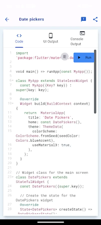
Date pickers 📅
Time pickers ⏰
Snackbar 🍔
Filled Text fields ✍️
Outlined Text fields ✏️
Common Text fields ✒️
Action chips 🍟
Choice chip ✔️
Filter chip 🔍
Input chip 💬
Checkbox ✅
Switch 🔀
Radio button 🔘
Sliders 🎚️
Banner 🎏
Tooltips ℹ️
Data tables 📊
Progress indicator 🔄
Divider ➖
Dialog Licenses 💬
Dialogs 💬
Bottom sheet Modal 🛌
Bottom sheet Persistent 🛌
Lists 📝
Grid lists 📊
Badges 🎖️
Navigation transitions 🚀
Typography 🖋️
Elevation ⬆️
Stepper 🚶
ListTile 📋
Icons 🔤
Animated Icons 🔄
ExpansionPanel 📁
Colors 🎨
Onboarding 🚀
Imagery 📸
Elevation ⬆️
Stepper 🚶
ListTile 📋
Icons 🔤
Animated Icons 🔄
ExpansionPanel 📁
Colors 🎨
Onboarding 🚀
Imagery 📸
Responsive and Adaptive 📱
Launch screen 🚀
Empty states ❌
Fade Scale Transition 🔄
Fade Through Transition 🔄
Shared X Axis Transition ↔️
Open Container Transform 🔄
Google Fonts 🅰️
Cupertino Activity indicator ⌛
Cupertino Alert Dialog 💬
Cupertino Action Sheet 💬
Cupertino Buttons 🔘
Cupertino Context menu 📋
Cupertino Date Picker 📅
Cupertino Time Picker ⏰
Cupertino Time Picker ⏰
Cupertino Navigation Bar 📱
Cupertino Picker 📅
Cupertino Scrollbar 📜
Cupertino TextField ✍️
Cupertino Search TextField 🔍
Cupertino Switch 🔀
Cupertino Segmented control 🔍
Cupertino Slider 🎚️
Cupertino TabBar 📑
WEB:
https://boltuix.github.io/
Flutter Material 3 Design Kit 🎨
App bar 📱
Bottom app bar ⬇️
Bottom navigation 🚶♂️
Navigation drawer 🗄️
Navigation rail 🚋
Tabs 📑
Elevated Button 🔼
Filled Button 🟦
Filled Tonal Button 🟦
Outlined Button 🛑
Text Button 🔠
Bottom navigation 🚶♂️
Navigation drawer 🗄️
Navigation rail 🚋
Tabs 📑
Elevated Button 🔼
Filled Button 🟦
Filled Tonal Button 🟦
Outlined Button 🛑
Text Button 🔠
Text Gradient Button 🌈
FAB Regular 💡
FAB Small 💡
FAB Large 💡
FAB Demo 💡
FAB Color Mappings 💡
FAB extended 💡
Icon Button 🔘
Icon toggle Button 🔘
Segmented Button 🔍
Menus 🍽️
Date pickers 📅
Time pickers ⏰
Snackbar 🍔
Filled Text fields ✍️
Outlined Text fields ✏️
Common Text fields ✒️
Action chips 🍟
Choice chip ✔️
Filter chip 🔍
Input chip 💬
Checkbox ✅
Switch 🔀
Radio button 🔘
Sliders 🎚️
Banner 🎏
Tooltips ℹ️
Data tables 📊
Progress indicator 🔄
Divider ➖
Dialog Licenses 💬
Dialogs 💬
Bottom sheet Modal 🛌
Bottom sheet Persistent 🛌
Lists 📝
Grid lists 📊
Badges 🎖️
Navigation transitions 🚀
Typography 🖋️
Elevation ⬆️
Stepper 🚶
ListTile 📋
Icons 🔤
Animated Icons 🔄
ExpansionPanel 📁
Colors 🎨
Onboarding 🚀
Imagery 📸
Elevation ⬆️
Stepper 🚶
ListTile 📋
Icons 🔤
Animated Icons 🔄
ExpansionPanel 📁
Colors 🎨
Onboarding 🚀
Imagery 📸
Responsive and Adaptive 📱
Launch screen 🚀
Empty states ❌
Fade Scale Transition 🔄
Fade Through Transition 🔄
Shared X Axis Transition ↔️
Open Container Transform 🔄
Google Fonts 🅰️
Cupertino Activity indicator ⌛
Cupertino Alert Dialog 💬
Cupertino Action Sheet 💬
Cupertino Buttons 🔘
Cupertino Context menu 📋
Cupertino Date Picker 📅
Cupertino Time Picker ⏰
Cupertino Time Picker ⏰
Cupertino Navigation Bar 📱
Cupertino Picker 📅
Cupertino Scrollbar 📜
Cupertino TextField ✍️
Cupertino Search TextField 🔍
Cupertino Switch 🔀
Cupertino Segmented control 🔍
Cupertino Slider 🎚️
Cupertino TabBar 📑
WEB:
https://boltuix.github.io/
