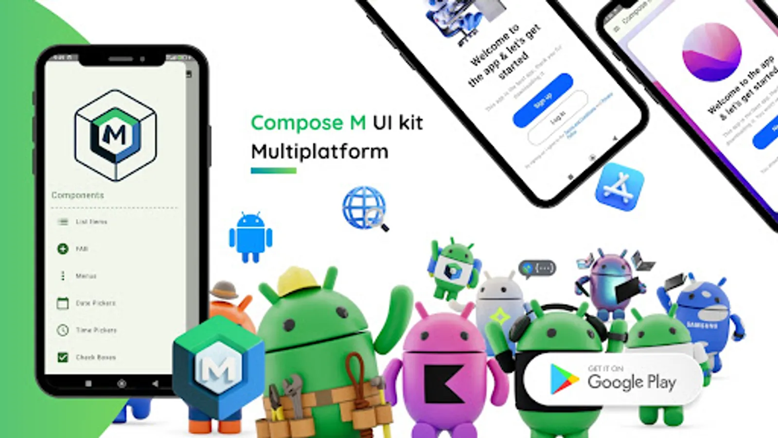
Compose M Multiplatform UI KIT
BOLT UIX
500+
downloads
Free
AppRecs review analysis
AppRecs rating 4.6. Trustworthiness 73 out of 100. Review manipulation risk 19 out of 100. Based on a review sample analyzed.
★★★★☆
4.6
AppRecs Rating
Ratings breakdown
5 star
67%
4 star
0%
3 star
33%
2 star
0%
1 star
0%
What to know
✓
Low review manipulation risk
19% review manipulation risk
✓
Credible reviews
73% trustworthiness score from analyzed reviews
✓
Good user ratings
67% positive sampled reviews
About Compose M Multiplatform UI KIT
📱 Compose Multiplatform UI Kit – App Template: The Ultimate Kotlin Material Design UI Toolkit
🎯 Our Mission
✅ Empower Android developers with a ready-to-use Material Design UI template.
⚙️ Streamline the process of converting design ideas into native Android UI.
🚀 Deliver intuitive, cutting-edge Material Design elements to your apps.
💡 Top Reasons to Choose Compose M Multiplatform UI KIT
🧩 Prebuilt UI Components: Reusable, adaptable templates for any project.
💻 Kotlin Integration: Seamlessly fits into Android Studio workflows.
🎨 Material Design Mastery: Build stunning, user-friendly UIs with ease.
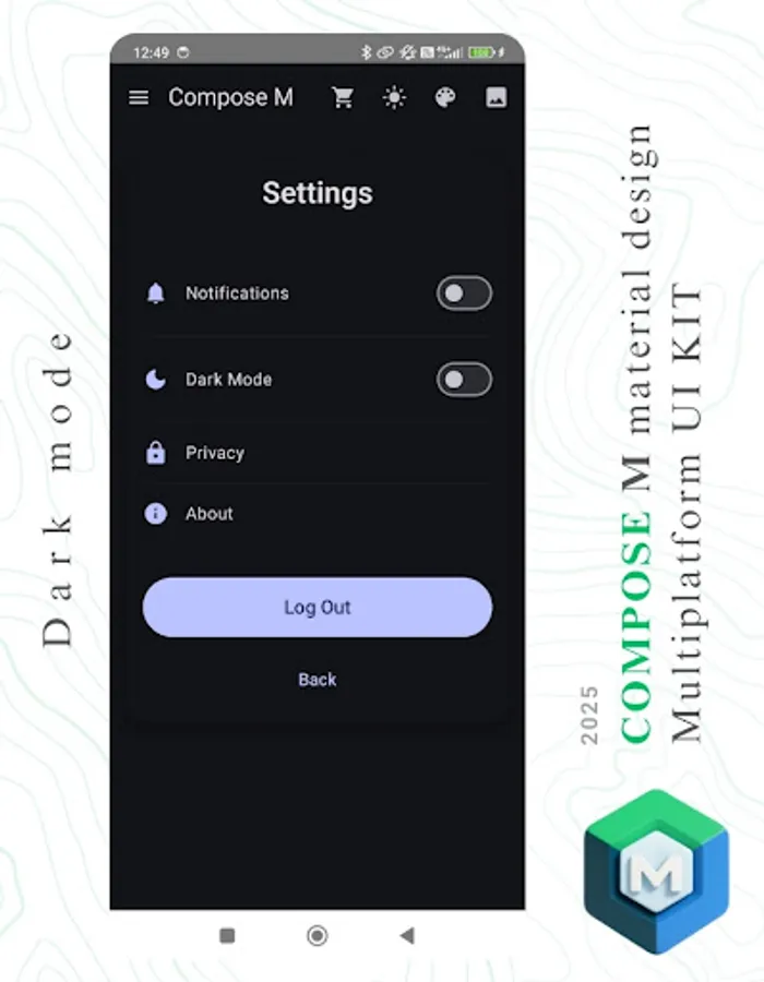
🌙 Dark Mode Ready: Optimized for both light and dark themes.
⏱️ Time-Saver: Focus on app logic while we simplify the design process.
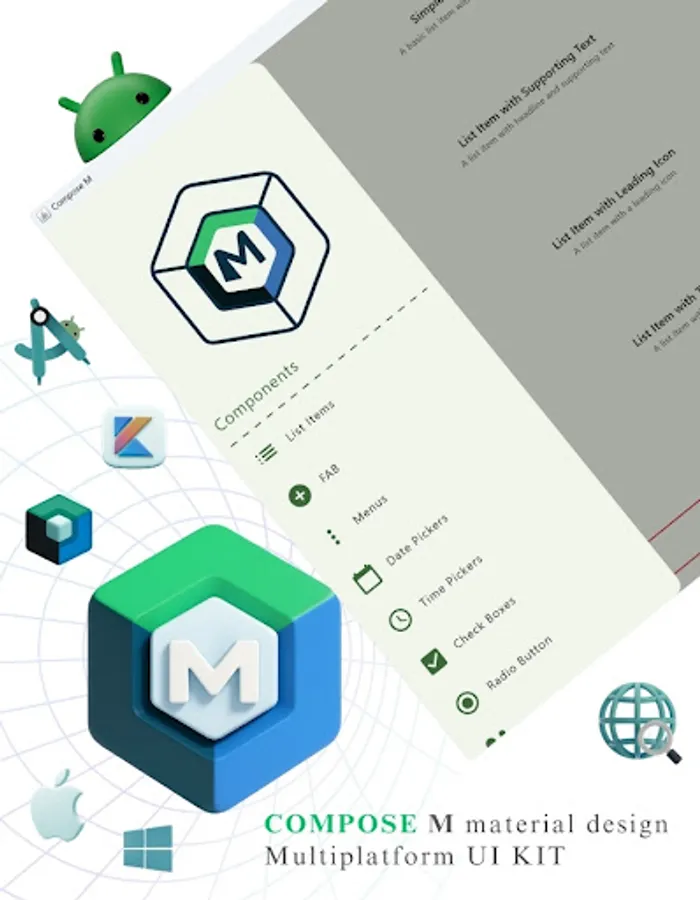
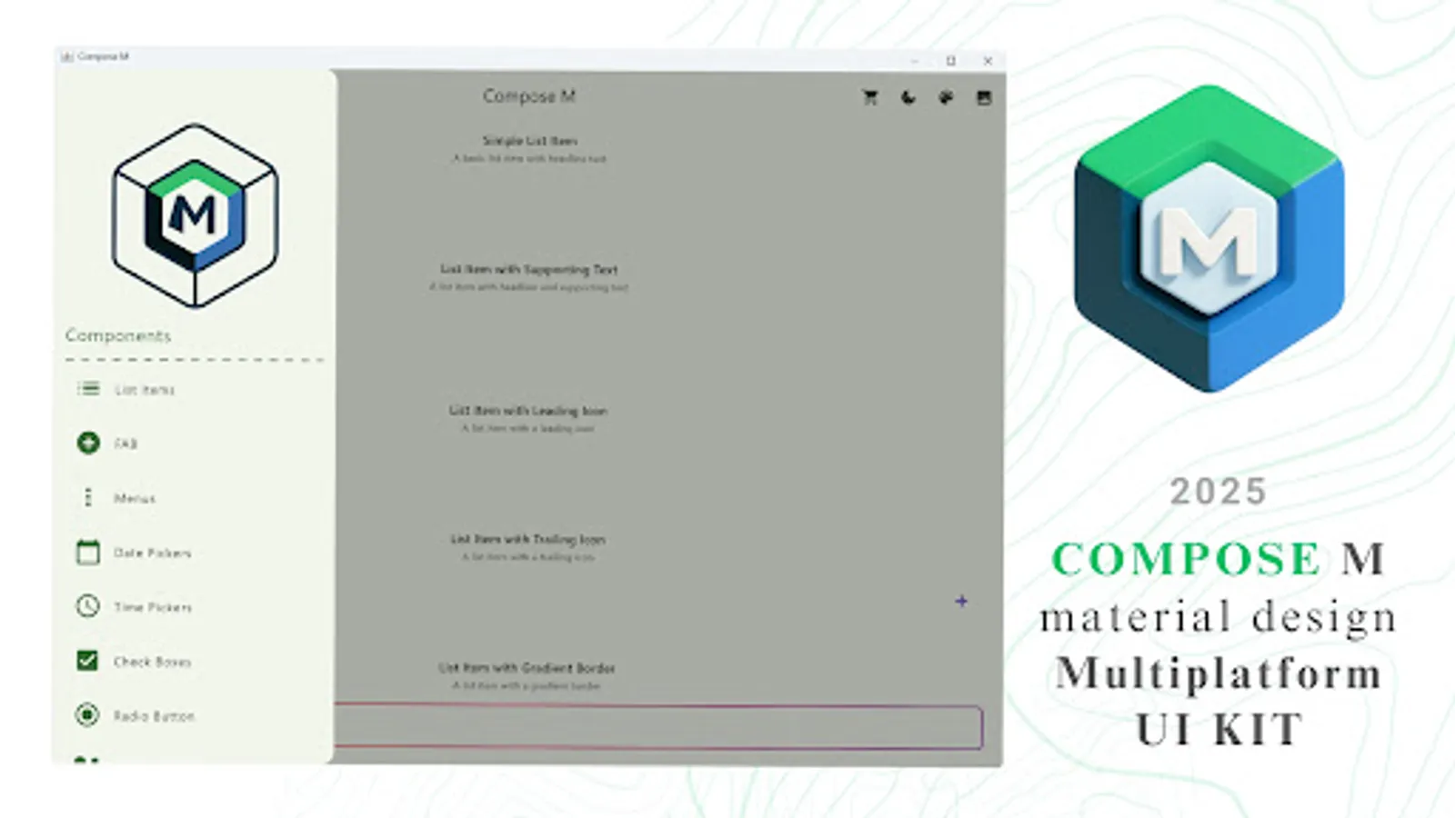
📦 What’s Inside?
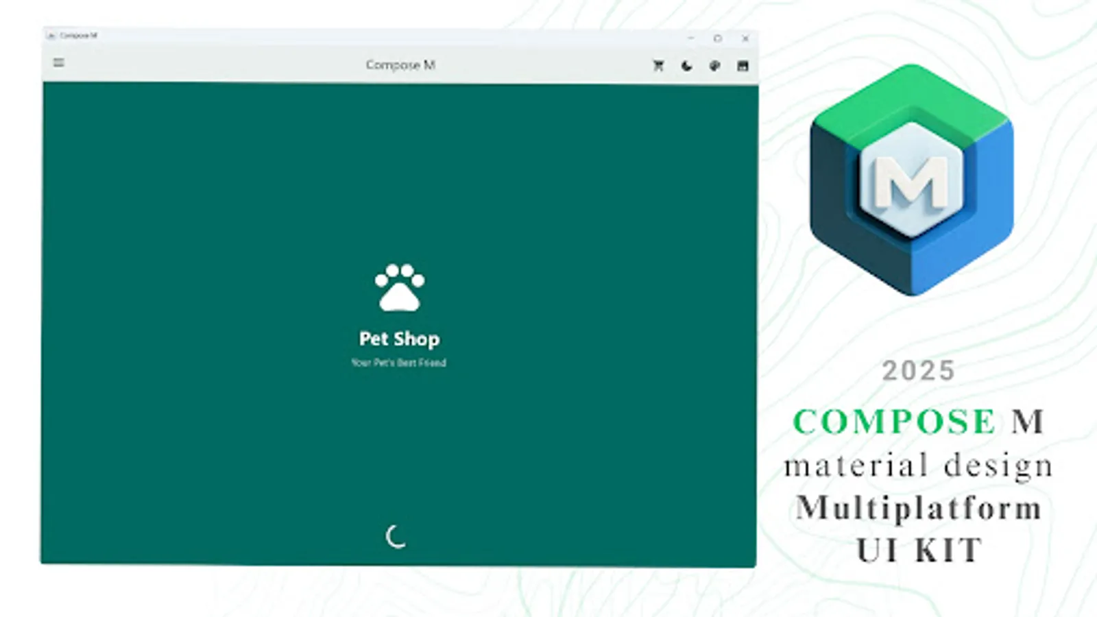
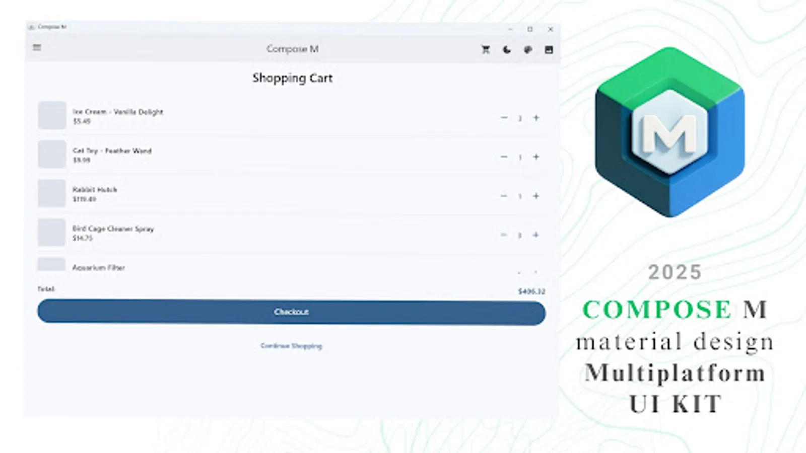
Boost your app development with a Compose Multiplatform UI Kit featuring 300+ Material Design components and screens — all tailored for efficient and beautiful user interfaces.
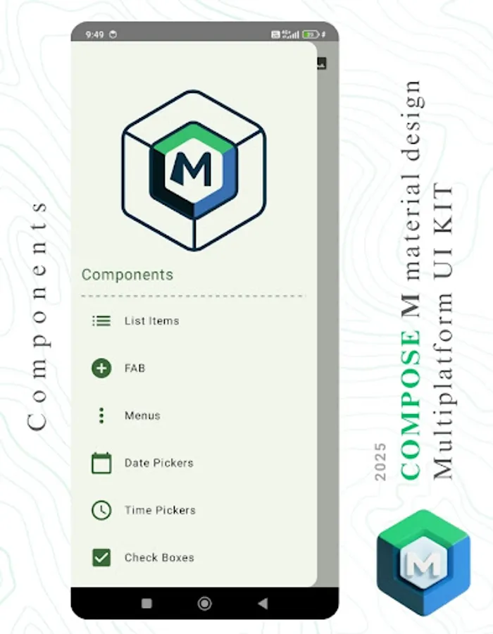
🧩 Core UI Components
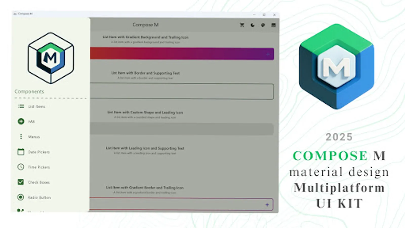
📋 List Items
➕ Floating Action Buttons (FAB)
📑 Menus
📅 Date Pickers
⏰ Time Pickers
✅ Checkboxes
🔘 Radio Buttons
🟢 Switches
🎛️ Sliders
🍭 Snackbars
✍️ Text Fields
🏷️ Tags
🎫 Badges
🔄 Loading Spinners
🪟 Bottom Sheets
💬 Dialogs
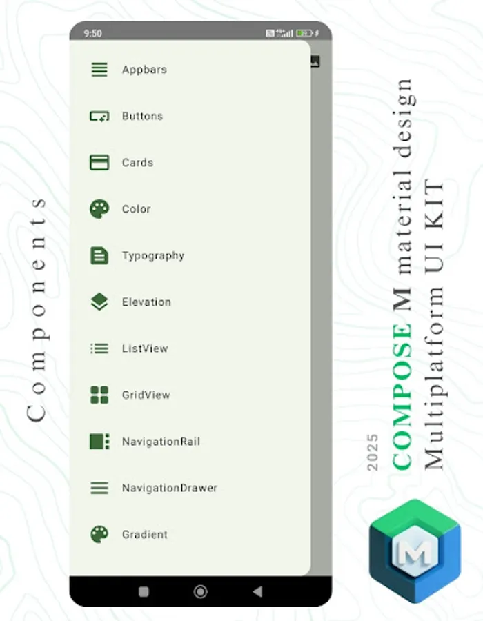
📶 App Bars
🔘 Buttons
🟦 Cards
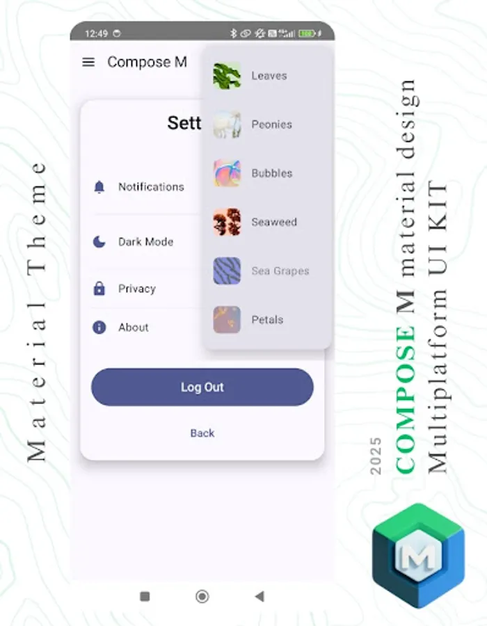
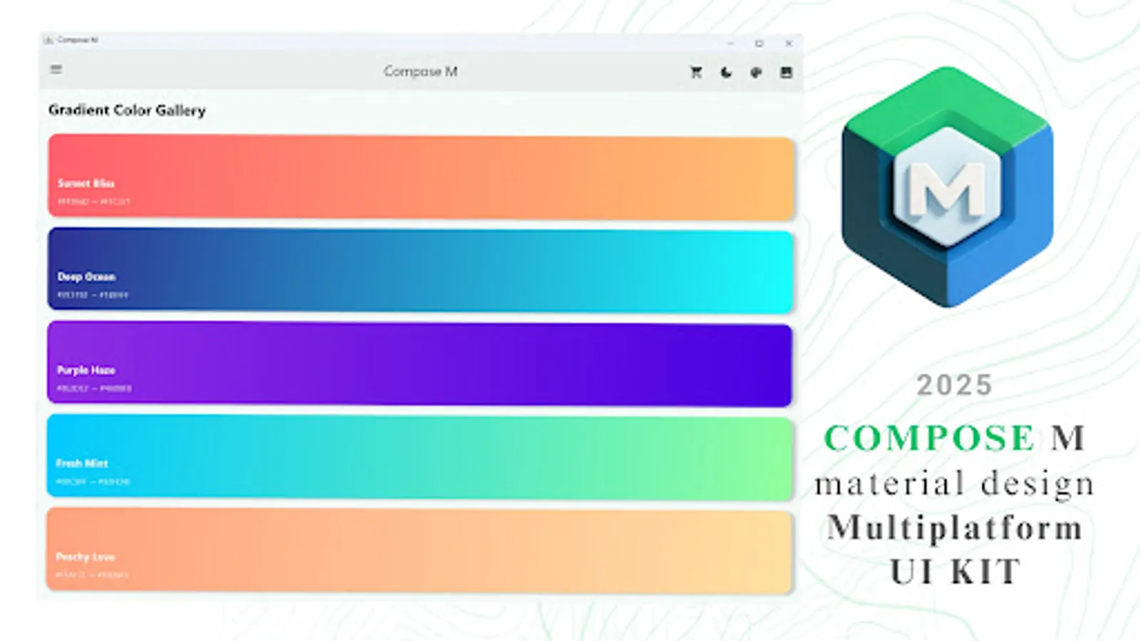
🎨 Color Palette
✏️ Typography
🪜 Elevation
🧵 Dividers
🔲 Shapeable Components
📐 Layouts & UI Views
🗂️ ListView & GridView
📚 Navigation Rail & Navigation Drawer
🌈 Gradient Showcase
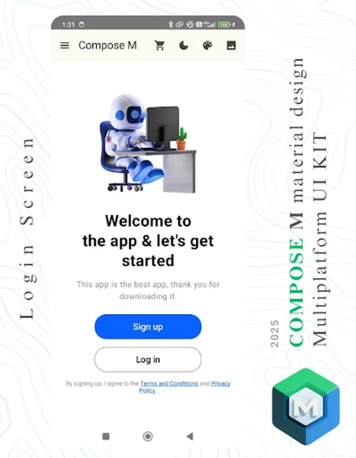
🖥️ Sample UI Screens
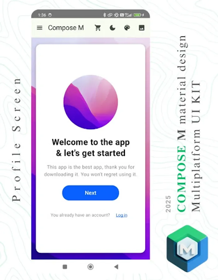
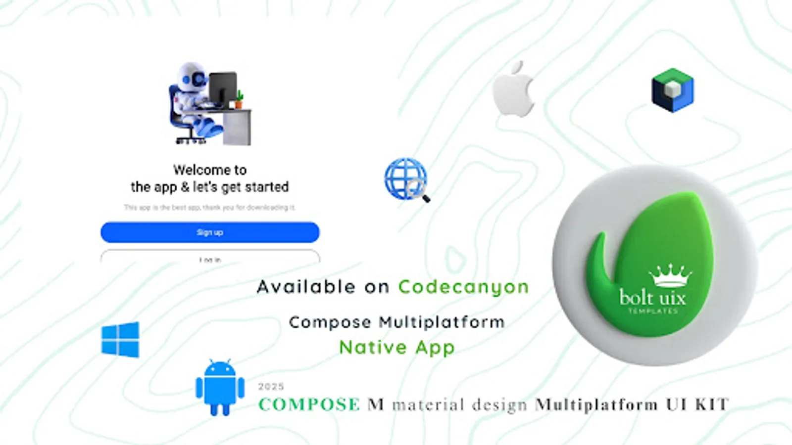
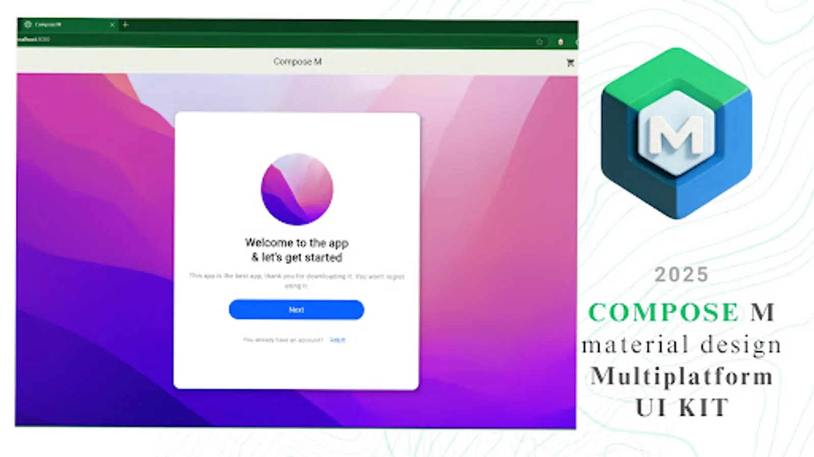
👋 Welcome Screen
🎓 Onboarding Flow
🔐 Login / OTP Verification
🧼 Empty State
🐾 Splash Screen
📱 Mobile Login (400x800)
💻 Desktop Login (1200x800)
🖼️ Welcome (1200x800)
🚧 Preview Version – More Coming Soon!
This is a preview UI template with a limited set of components to showcase what’s possible.
📅 Upcoming additions:
🧱 More UI widgets
🎞️ Advanced animations
🎯 Refined Material 3 support
🖥️ Expanded multiplatform layouts
📬 Stay tuned — big things are on the way!
This is a developer demo build showcasing UI samples. Some features may be incomplete or under development.
Developer Notes:
Welcome to the Jetpack Compose Dev community - your space to learn, share, and master modern Android UI with Jetpack Compose, Kotlin, and KMP. Ask questions, showcase your UI, explore tutorials, share tips, get feedback, and connect with developers building the future of Android and cross-platform apps. Whether you're a beginner or experienced, join us in advancing Compose and Kotlin Multiplatform together.
https://www.reddit.com/r/JetpackComposeDev/
🎯 Our Mission
✅ Empower Android developers with a ready-to-use Material Design UI template.
⚙️ Streamline the process of converting design ideas into native Android UI.
🚀 Deliver intuitive, cutting-edge Material Design elements to your apps.
💡 Top Reasons to Choose Compose M Multiplatform UI KIT
🧩 Prebuilt UI Components: Reusable, adaptable templates for any project.
💻 Kotlin Integration: Seamlessly fits into Android Studio workflows.
🎨 Material Design Mastery: Build stunning, user-friendly UIs with ease.
🌙 Dark Mode Ready: Optimized for both light and dark themes.
⏱️ Time-Saver: Focus on app logic while we simplify the design process.
📦 What’s Inside?
Boost your app development with a Compose Multiplatform UI Kit featuring 300+ Material Design components and screens — all tailored for efficient and beautiful user interfaces.
🧩 Core UI Components
📋 List Items
➕ Floating Action Buttons (FAB)
📑 Menus
📅 Date Pickers
⏰ Time Pickers
✅ Checkboxes
🔘 Radio Buttons
🟢 Switches
🎛️ Sliders
🍭 Snackbars
✍️ Text Fields
🏷️ Tags
🎫 Badges
🔄 Loading Spinners
🪟 Bottom Sheets
💬 Dialogs
📶 App Bars
🔘 Buttons
🟦 Cards
🎨 Color Palette
✏️ Typography
🪜 Elevation
🧵 Dividers
🔲 Shapeable Components
📐 Layouts & UI Views
🗂️ ListView & GridView
📚 Navigation Rail & Navigation Drawer
🌈 Gradient Showcase
🖥️ Sample UI Screens
👋 Welcome Screen
🎓 Onboarding Flow
🔐 Login / OTP Verification
🧼 Empty State
🐾 Splash Screen
📱 Mobile Login (400x800)
💻 Desktop Login (1200x800)
🖼️ Welcome (1200x800)
🚧 Preview Version – More Coming Soon!
This is a preview UI template with a limited set of components to showcase what’s possible.
📅 Upcoming additions:
🧱 More UI widgets
🎞️ Advanced animations
🎯 Refined Material 3 support
🖥️ Expanded multiplatform layouts
📬 Stay tuned — big things are on the way!
This is a developer demo build showcasing UI samples. Some features may be incomplete or under development.
Developer Notes:
Welcome to the Jetpack Compose Dev community - your space to learn, share, and master modern Android UI with Jetpack Compose, Kotlin, and KMP. Ask questions, showcase your UI, explore tutorials, share tips, get feedback, and connect with developers building the future of Android and cross-platform apps. Whether you're a beginner or experienced, join us in advancing Compose and Kotlin Multiplatform together.
https://www.reddit.com/r/JetpackComposeDev/


