AppRecs review analysis
AppRecs rating 4.2. Trustworthiness 79 out of 100. Review manipulation risk 22 out of 100. Based on a review sample analyzed.
★★★★☆
4.2
AppRecs Rating
Ratings breakdown
5 star
76%
4 star
0%
3 star
5%
2 star
10%
1 star
10%
What to know
✓
Low review manipulation risk
22% review manipulation risk
✓
Credible reviews
79% trustworthiness score from analyzed reviews
✓
High user satisfaction
76% of sampled ratings are 4+ stars (4.2★ average)
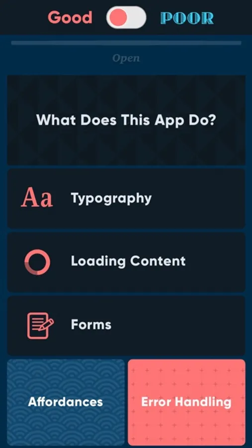
About Good vs. Poor UX
This app illustrates how two digital experiences can meet the same set of requirements—on paper—yet deliver wildly different results.
Check out some extreme examples of good vs. poor design and development practices. We hope you find it educational or at the very least, amusing. :-)
Good vs. Poor UX Screenshots

Tap to Rate:
Reviews for Good vs. Poor UX
Tacoma Pete
Great idea but broken
I love the idea of this app, it could be a great resource for those new to the field. But the app is very broken now…for example there is a lot of white on white text
xlovexyz7
A honest critique from a UX Fox
Update the Design specifically the color. The grey background and white typeface that you used for most of the headers is hard to read. I love typography so I went to that section first. I honestly thought I was on the poor example. When I clicked to the poor I was able to read. So when I clicked on the good again I was shocked. Again the light gray background color and white typeface is so hard to read. Outside of that great tool. I wish there was more examples and a more modern UI.