In this match-color puzzle game, you adjust sliders to replicate target colors using RGB and HSB models. Includes color precision scoring, device synchronization, and social sharing options.
AppRecs review analysis
AppRecs rating 4.7. Trustworthiness 69 out of 100. Review manipulation risk 44 out of 100. Based on a review sample analyzed.
★★★★☆
4.7
AppRecs Rating
Ratings breakdown
5 star
81%
4 star
11%
3 star
6%
2 star
2%
1 star
0%
What to know
✓
Authentic reviews
Natural distribution, no red flags
⚠
Questionable review patterns
44% review manipulation risk - some review patterns appear unusual
⚠
Rating authenticity concerns
High rating concentration (81% 5-star) in sampled ratings
About Color Match Game: Chroma
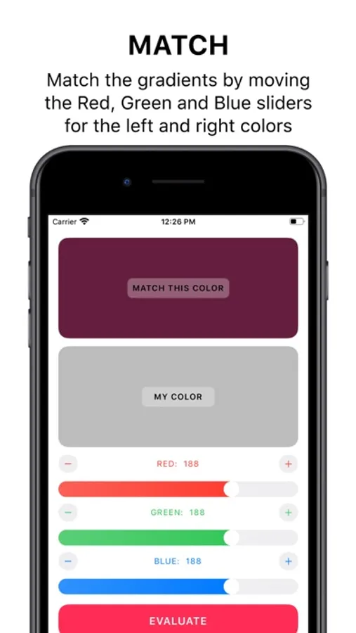
The game is as straightforward as it can be - match the given color by moving the sliders on the screen.
Bring out the best designer vision of yours to match the beautiful colors.
With a neat and simple interface, combined with an appealing design that looks gorgeous in Dark Mode, enjoy endless number of colors to match.
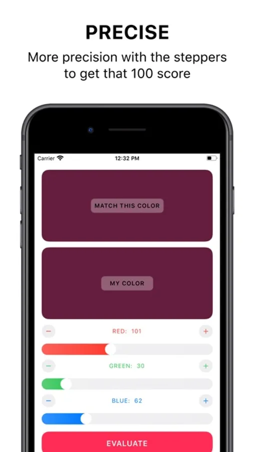
Use the sliders and stepper for each color for more precise control, to match exactly. Play with both RGB (Red, Green and Blue) and HSB (Hue, Saturation and Brightness) color models.
There is no time limit, so take your time to try and perfectly match each color, and get as close to the target for your satisfaction.
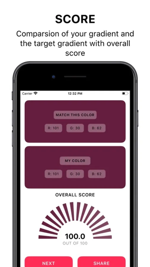
Get a detailed score of the target color and your color with points out of 100.
You can also sync all the target colors across all your devices.
You can also share your amazing score on social media to your friends, and invite them to play too!
Remember, it looks simple, but it is an addictive game!
Here are some reviews -
"Damn, never imagined this game to be this addictive. Great job!"
"Can’t stop playing with the colors!! Amazing app!!"
"I can’t get enough of this game!!"
Created by indie developer Rudrank Riyam (@rudrankriyam)
Color Match Game: Chroma Screenshots
Tap to Rate:
Reviews for Color Match Game: Chroma
Smfplayer1
Great game for designers but poor UI
Great game to help graphic designers understand how digital color works. However, the interface needs a lot of work. For one, the Evaluate button is way too close to the sliders. I am constantly hitting that button when I am trying to adjust the bottom slider. Honestly, the color sample boxes should be smaller, and I recommend making the square and setting them side by side. This will give a lot more space for the sliders themselves, which is definitely needed because these are touch controls and the are too crowded. It’s too easy to tap on the wrong place when your eyes are trying to focus on the color boxes.
ggdhdjtktn
Ssdffgn
Bbbbbbbb