About CryptoCorrelationRadar
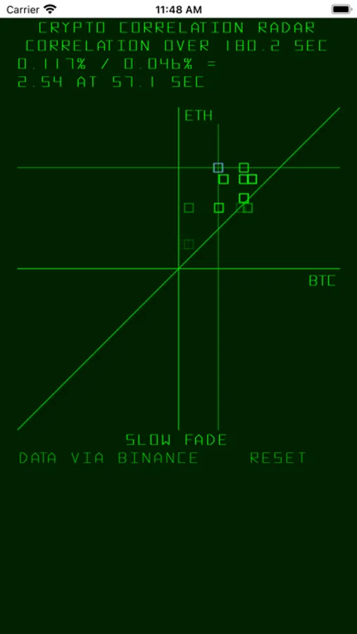
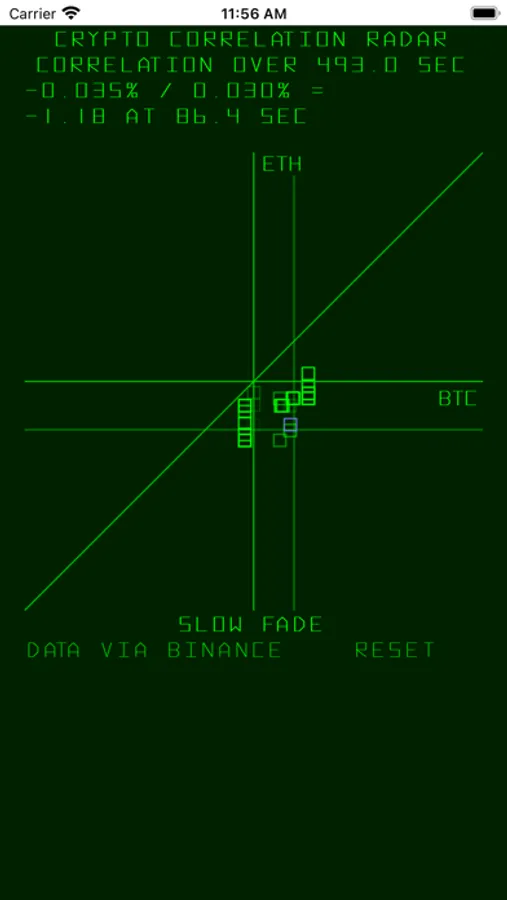
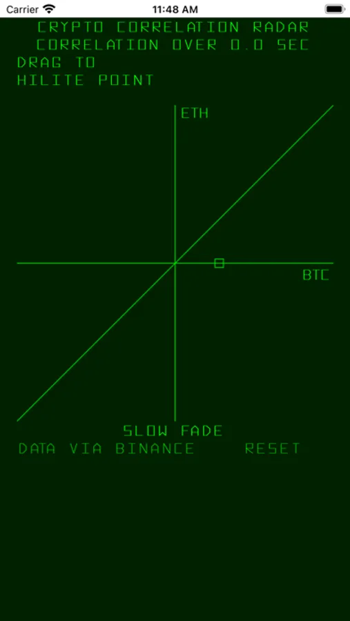
Visualize like it's 1975! If crypto currency was invented then, this is one way you might visualize it. Shows short term correlations or lack thereof between BTC and ETH streaming returns, which is a different view than the normal time series charts. Uses streaming data from Binance to compute % change of each asset since first data arrives after app launch, and shows these changes on an XY graph. Each point represents a pair of percentage changes referred back to app launch time (not since the last point). As such, newer points represent larger time deltas. The diagonal line represents perfect correlation which of course never occurs. Older points fade out. Shows time since first data point. Useful to show short term divergences in correlation between the assets. If more points from one asset stream into the app while the other asset's data stream is idle, we show all of the points, referring back to the constant coordinate. Since x and y data roll in separately from the stream, the x and y time stamps are not perfectly aligned, but we use the data we have available to get a best approximation of, as Marvin sang, what's goin' on.
CryptoCorrelationRadar Screenshots
Tap to Rate: